Introduction
Building forms with validation is tedious and repetitive. So my friend and I created a library of form input components so we can just copy the code in every code base, styled minimally with all error validation message using Tailwind CSS and react-icons.
Demo Link
For the demo please visit rhf.thcl.dev
I'm open for all suggestions and contributions to improve 🚀. Open a PR on the repository (available on the demo website) or email me at me@highflyblog.tech
Yup Demo
I also made a validation using Yup, you can access it on https://rhf.thcl.dev/yup along with the source code.
Setup
1. Install these dependencies
yarn add react-hook-form @tailwindcss/forms react-icons

optional

yarn add react-datepicker react-dropzone react-select
2. Configure tailwind.config.js to use @tailwindcss/forms
// tailwind.config.js
module.exports = {
  theme: {
    // ...
  },
  plugins: [
    require('@tailwindcss/forms'),
    // ...
  ],
};
3. Form Structure
This is the default boilerplate, then you can insert the components inside the form
import { FormProvider, useForm } from 'react-hook-form';

export default function Page() {
  const methods = useForm();
  const { handleSubmit } = methods;

  return (
    <>
      <FormProvider {...methods}>
        <form onSubmit={handleSubmit(onSubmit)}>Inputs Here</form>
      </FormProvider>
    </>
  );
}
Default Form Components
1. TextInput
Normal Text Input, with error validation

2. PasswordInput
Password input with peek functionality

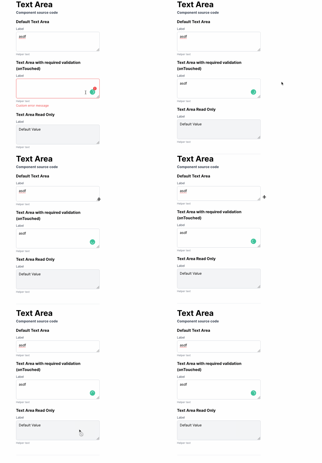
3. TextArea
Normal TextArea Input

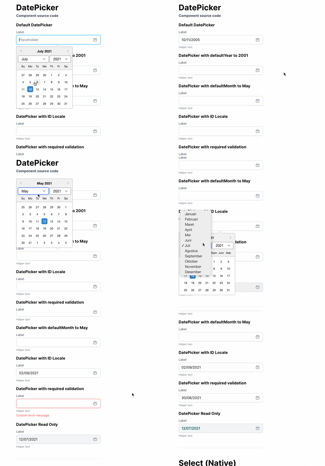
4. DatePicker
Using react-datepicker library, provided with useful props like defaultYear, defaultMonth, locale lang

5. Select (Native)
Select Input using composition

6. File Upload Dropzone
Using react-dropzone library, we can specify selected file extension in the props

7. Select (react-select)
Using react-select library, allowing us to search on the select input
